Core Hydration +
Spring 2024
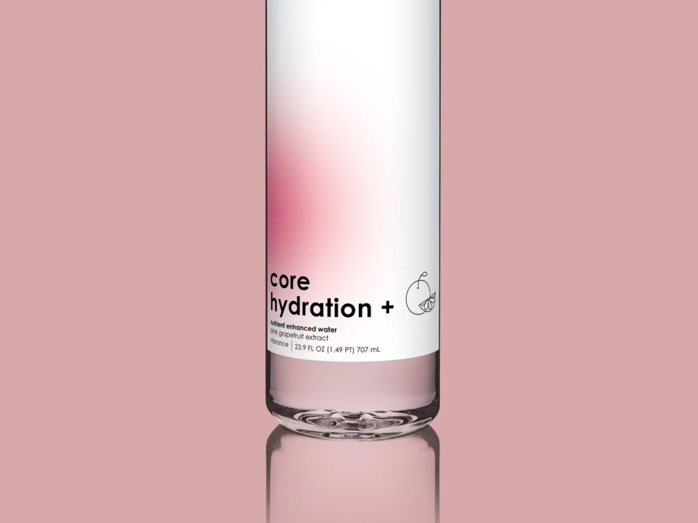
Packaging
A redesign of Core Hydration’s flavored water bottle packaging targeted towards young adults. The design utilizes the gradient from the brand’s original logo as a design element to symbolize the flavor by its color, as well as a different set of icons to represent each flavors vitamins and benefits. There is much more negative space on this redesign than on the previous label in order to emphasize the cleanliness and health that the company prioritizes.